Plotting autocorrelation with matplotlib
Part of time series analysis deals with pinning down the stochastic process that generated the data. If we know how this process looks like, we will be better able to predict its future values.
As it is usually the case, it turns out that this is easier said than done. Pinning down the “right” process is a highly complex thing. Part of the initial process entails checking the degree of autocorrelation of the variable we are estimating.
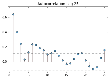
Graphs can be fairly informative for this purpose. They convey a clear idea about what periods have a heavy influence on our process. matplotlib offers a direct way of plotting the autocorrelation graph. However, I was not exactly happy with the format nor the options given.
I used a bit of numpy and matplotlib to generate my own autocorrelation graphs. The code is simple and you can find it in my github.
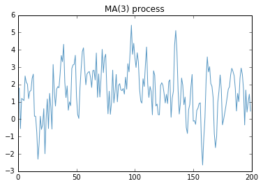
Easy example: First I created the following MA(3) process:
Simply put, this means that the next period will be heavily and positively influenced by what happens three periods before.
In the graph, we should observe three significant spikes, corresponding to those first three periods.
Feel free to play around with the code, extend it, and let me know what you think!