On histograms and kernel densities (I)
Histograms and kernel densities are ubiquitous in data analysis. At a exploratory stage, we want to know about the variables’ distribution. You can quickly check some descriptive statistics like the mean, variance, percentile and kurtosis. Or, to have a clear picture, you can plot histograms or kernel densities.
While histograms are quite intuitive to understand, I find that kernel densities are less so. This need not be the case. It turns that both distributions plots are closely related. As a bonus, a good understanding of kernel densities goes a long way. This is key for other topics as kernel regression and causal inference techniques, like matching.
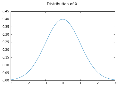
Let’s start by proposing a random variable with a given distribution. We will talk about that follows a standard normal distribution . This is how the probability density function of the variable looks:
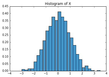
Unfortunately, most of the time we are not given a distribution. We just have some data samples. In this case, a histogram or a kernel density is needed to determine how does the distribution look. Suppose, for what follows that we have taken a 1000 samples from variable . We now want to know a bit more about its distribution.
A histogram is basically putting these values in some boxes, better known as bins. These bins are equally ranged intervals. Basically what is happening under the hood is that data is sorted according to which bin belongs to. Then, to reflect how much data is collected in the bin, heights are correspondingly assigned. I wrote the following code to make equally sized bins given some input data and the selected bin width.
Diclaimer 1: I just wrote this code for didactic purposes if you want to plot histograms check histogram plotting in matplotlib. Diclaimer 2: Properly selecting the bin width is an art of its own, and has important implications when trying to spot your data’s distribution.
Disclaimers away, here is some code that will create the bins, according to the bin width selected.
def data_bins(array, binwidth):
    """Creates binwidths according to
    the number of the width given."""
    bands = []
    j = 1
    stop = False
    while not stop:
        x_0 = np.amin(array)
        beginning = x_0  + (j-1)*binwidth
        end = x_0  + j*binwidth
        bands.append((beginning, end))
        if end > np.amax(array):
            stop = True
        j += 1
    bands = np.array(bands)
    return bands
The easiest way to figure out what this is doing is by imagining we are given all the range of the data and we want to perform some cuts. These cuts are of a special kind, however, as they will be of equal length. The next step is to put the data in the right bins and assign a particular height according to how much data is within that bin.
def obs_in_bin(array, binwidth):
    """"Puts the observation in its
    corresponding bin, according to the
    specified bin width."""
    num_per_bin = []
    cal_bands = data_bins(array, binwidth)
    for bands in cal_bands:
        num_per_bin.append(np.sum((array>= bands[0])
         & (array < bands[1])))
    num_per_bin = np.array(num_per_bin)
    freq = num_per_bin / (len(array)*binwidth)
    return freq, cal_bands
An important thing to remember is that this is not a frequency chart, i.e. the height of the bar does not give us the probability of observing a value within that range. Remember that the histogram is trying to approximate the density of the variable. Plotting our results only takes one easy step:
freq_bin, cal_bands = obs_in_bin(ran_num, 0.25)
fig, ax = plt.subplots()
for i in range(len(cal_bands)):
    ax.bar(cal_bands[i][0], freq_bin[i], 0.25)
plt.title("Histogram")
Here is the graph for a bin width of 0.25:
Now that we know more about histograms, it will be easier to figure out what kernel densities are.