On histograms and kernel densities (II)
Histograms are a great tool for determining a variables’ distribution. As I explained in last post, the process of constructing a histogram can roughly be equated to:
- Creating buckets of equal range.
- Sorting your data into the different buckets.
- Assigning relevance to the bucket according to how much data it contains.
Sometimes a histogram is all you need to get a rough idea about how your variable is distributed and what values are more likely. However, histograms have limitations. Let’s look at the following picture. The picture shows a histogram for 100 samples drawn from variable that follows a standard normal distribution. On top, I have laid out the actual density values for the points drawn. What we get are points that follow the familiar bell shaped curve of the normal distribution.
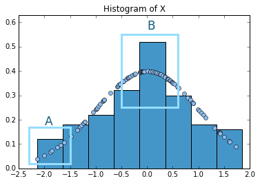
I have marked two zones as A and B to illustrate two problems. First, let’s look at A. We can observe that, even when the points of the actual data have a positive slope, this is somewhat hidden inside the box. In other words, all the points inside the box are given the same relevance. This may lead to overlook more subtle patterns. Now let’s look at B. There is a huge jump between one box and the other. However, if we look at the underlying distribution, it is quite smooth, i.e. there are no real jumps. Thus, just by looking at the histogram we might be prone to believe that our distribution presents some discontinuities or jumps that are not really observed.
This is where kernel densities come handy. While in histograms we sort data into chunks and all the ones that fall into a bucket are given the same importance, with kernel densities the evaluation is made point by point. The basic idea that underpins kernel density is that if a density is particularly high in certain area (i.e. if the values of a random variable are more likely in a certain region), then we would observe more realizations of the variables in that area. Therefore, the density value of a certain point depends on how many others are next to it.
Let’s take the following figure for illustrating purposes. I have zoomed in frames A and B of the above figure.
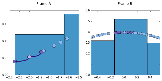
From here we can see how different two points are, considering how many neighbors they have. Note how much distance we have to go over for our reference point (the one in light purple) to find another point. In the same distance that it takes our reference point to find the two closest points, B’s reference point finds 15. These points are highlighted in a different shade of purple. Naturally, a proper kernel density should take this into account. More relevance, thus, should be given to reference point B. But exactly how much relevance should that be, and, furthermore, what is the appropriate distance to consider?
Let’s start with the second question. This is also known as the problem of bandwidth selection. Bandwidth is the distance that will be considered from left and right of each point. One could imagine as opening a window from each and every point. The bigger the window, the more points will be considered. One must be very careful when selecting the bandwidth, too big/small bandwidths can lead to oversmoothing/overfitting.
In order to give an appropriate weight to each point, the kernel density uses the following formula:
where, selected bandwidth, total data points, the specific kernel function selected, point whose kernel density we want to find. As complex as it may seem, the formula is relatively straight forward. The main factor to understand is the expression within . This expression is basically measuring the distance of our reference point x to the other data points and dividing it by our selected bandwidth. Knowing these distances will be important when assigning a score. Only the observation that are within the bandwidth will be given a score. Also, the farther the “neighbors” are from our reference point, the less score they will convey.
There are multiple choices for kernels. I will use here the Epanechnikov. If we take to be the expression inside of the fraction, the Epanechnikov kernel assigns relevance to the points in the following way: . The is an indicator function that makes sure that only the points that are within the bandwidth get evaluated. The other part is a weighting rule, by which nearer points get a higher score.
Let me try to make this clear with a toy example. Let’s say that we want to estimate kernel density function of a data point x=4 in two data sets. To make calculations simpler, I choose a bandwidth of one for both data sets.
From the outset, note that only those points that are within the selected bandwidth will be estimated. The indicator function evaluates to zero for all points outside the selected window. Also, note how the weights change from one data set to the other. One can notice two important changes in the estimated weight values for data set A and B. The first one is regarding points and . Even when they are at the same distance from the reference point in both data sets, in B they receive a lower weight. The explanation is simple. One can see in the formula that the weight of each point is multiplied by . Therefore, the bigger the number of the points in a certain data set, the lower this fraction will be. As the data set B has more points (), the original contribution of these points is weighted down by this factor. The second and more important take away is given by the two new points introduced in B. Note that these are really close to 4. Therefore, according to the weighting scheme, this give a bigger weight to the point under evaluation.
To calculate a kernel density one needs to follow the previous process for each and every single point of the data set. Here is the code I created to calculate kernel densities with a Epanechnikov function. This code is just for leaning purposes. If you want to estimate the kernel density for a given data set, this option is already available by different packages in Python. You can learn more about them and their advantages/disadvantages here.
def kernel_output(num_array, bandwidth):
"""Performs Kernel Epanechnikov smoothing
to construct a kernel density plot."""
kernel_func = []
num_array_sort = np.sort(num_array)
for item in num_array_sort:
point_dif = (num_array_sort - item) / bandwidth
point_dif = np.where(
np.abs(point_dif) >= 1, 0, point_dif)
#Implements Epachevnikov kernel function
epachev = (3/4)*(1-(point_dif[point_dif!=0])**2)
sum_epa = (1/(len(num_array_sort)*bandwidth))
*np.sum(epachev)
kernel_func.append(sum_epa)
kernel_func = np.array(kernel_func)
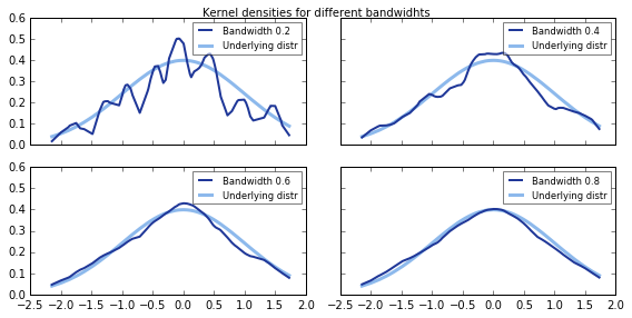
return kernel_funcI used this code to plot the kernel density of our standard normal distributed variable that we saw in the beginning of the post. In the graph, we can see the original probability density function and how it is estimated by the kernel density. Note also how relevant is bandwidth selection. Bandwidths that are too low or too high will not yield an appropriate estimation of the density.