Plotting Maps with GeoPandas
As part of a project I was working on, I had to scrape data from Open Street Map. I scraped data from Lima, the city where I come from. As always with cleaning scraped data, the process can be painstaking. You can check it here.
Once having cleaned the data, I was ready for doing some exploratory analysis. As I was dealing with georeferenced data, I thought it would be appropriate to take advantage of it plotting some nice maps. How difficult could it be?
The answer, as with most of the things, is that it depends. GeoPandas makes working with shape files and geo data easier. However, there are some things I have learnt during the process. Here are some tips I wanted to share:
Know your coordinates
When plotting on a map chances are you will be dealing with shape files. A shape file is a number of files that basically contain the geometrical shapes that describe a location. For example, for my project, I used a shape file of Peru with all its districts (the smallest governmental unit.) You can download the file here.
GeoPandas makes importing the shape file really easy. You get back a data frame, just like in pandas. The interesting thing is that it comes with an extra columnn named geometry. This column contains all of the shapes related to a location.
Once you have your dataframe, you can proceed as you would do with any other dataset. For example, as I only wanted to work on the city of Lima and its related districts, I subset the data correspondingly.
#Creating maps from existing shapefile
shp = gp.GeoDataFrame.from_file('BAS_LIM_DISTRITOS.shp')
shp_dist = shp.query("'LIMA' in NOMBDEP and
                      'LIMA' in NOMBPROV")
shp_lima = shp_dist.append(shp.query("'CALLAO' in NOMBDEP"))
Once there, what I should have done, is to know what the projection of my data was. Believe me, it would have saved me from a lot of pain! Basically, all of the 2D images of maps that we see use some kind of projection to translate the shape of the earth to a plane. I was really surprised to see how many projections there are. That lead to an obvious question: well, what kind of projection is used in this file. After some head scratching, I realized that GeoPandas comes with a method called .crs (reading the docs ahead could save you from this pain1
), which will give you the type of projection being used. This will become very handy, trust me.
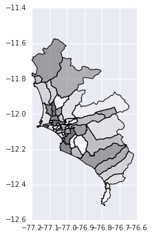
Having said that, there is no need to know what your projections are if all you want to do is a plot of the file. You simply need to do shp_lima.plot(). and voilà:
However, chances are that you want to do a little bit more than having an image of the location you are plotting. In my case, I wanted to use the data I scraped from Open Street maps to observe some patterns in the map.
To start with, the data I had collected from Open Street Map where a bunch of latitude and longitude points per observation. If you want to draw these points, you need to pass the appropriate shape figure to them. Once you have the appropriate shape figure you can pass it to a GeoPandas data frame.
bank_points = df_banks[['lon', 'lat']].apply(lambda row:
              Point(row["lon"], row["lat"]), axis=1)
geo_banks = gp.GeoDataFrame({"geometry": bank_points,
			"bank_names": df_banks["bank_names"]})
Now you’d think: well I have my points and my shapes, let’s bring it all together into a nice map. Well, not really. Remember the thing about the coordinate system. The problem is that your recently created GeoPandas dataframe is coordinate system ignorant. You need to give it a proper coordinate system so the plotting runs smoothly. This means that both the data set, the one that contains your map and the one that has your points, should be in the same coordinate system. In my case, I used the WGS84 for both.
shp_lima.crs = {'init': 'epsg:4326'}
geo_banks.crs = {'init': 'epsg:4326'}
From then on, plotting is not that complicated. Here I am plotting the location of banks in the city of Lima.
fig, ax = plt.subplots(1, figsize=(3.5,7))
base = shp_lima.plot(ax=ax, color='gray')
             geo_banks.plot(ax=base, marker="o",
             mfc="yellow", markersize=5,
             markeredgecolor="black", alpha=0.5)
_ = ax.axis('off')
ax.set_title("Plot of banks in Lima")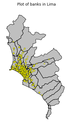
Note that basically the plotting takes up one line. That’s really awesome.
Merging Spatial Data
Afterwards, I wanted to have an idea of what was the concentration of banks per district. Having plotted the points on the map was interesting, however there was so much data that it made impossible to observe tendencies by districts. This is where merging comes in handy. So far, I just got a data set with the shapes of the districts and one with points of the banks. I needed a way to put everything together. I wanted all those banks that lie within the boundaries of a district to be matched to that particular district. This is fairly easy to do with GeoPandas sjoin() method.
sjoin() performs a spatial join. In my case, it basically checked if the points of the banks where within the boundaries of the districts’ shapes. Let me be more clear. For example, in my geobanks dataset, I have the following point belonging to a bank.
geo_banks.head(1)
+----+----------+------------------------+
|    |bank_names|      geometry          |
|----+----------+------------------------|
|  1 | BCP      |POINT (-77.093 -12.077) |
+----+----------+------------------------+
With this information, we don’t really know to which district this point belongs to. This is why we need to merge this data with the districts data.
lima_banks = geopandas.tools.sjoin(geo_banks, shp_lima,
				how="right", op='intersects')
Now, each bank is related to the district where its coordinate points lay on. You can see an example below.
lima_banks.head(1)[["bank_names", "NOMBDIST", "geometry"]]
+----+----------+----------+-------------------------+
|    |bank_names| district |      geometry           |
|----+----------+----------+-------------------------|
|  1 | BCP      |SAN MIGUEL|POLYGON ((-77.016 -12.0..|
+----+----------+----------+-------------------------+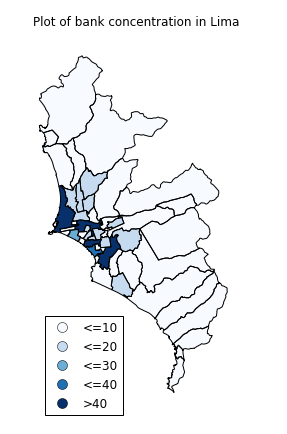
Inspecting the map, you can see that there are multiple big districts on the periphery that do not seem to have many banks. Also, there are small districts within the city that seem very relevant. However, given that they are so small in comparison to these big districts on the periphery, we do not really get to have a clear picture of them.
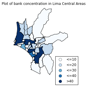
If I wanted a close inspection of these smaller and central districts, I had two options: First, given that I had a list with the name of the districts, I could select the districts I wanted to include in my analysis. This would be definitely have been time consuming.
Another option was using GeoPandas methods. Checking the documentation, I noticed two interesting methods: centroid and distance(). The centroid method gives you the center of a Polygon. I used this method to calculate the center of San Isidro, Lima’s financial district. With this result, I used distance() to calculate the distance between the districts and this center. I then use this result to pick the districts within a certain distance.
#Calculating center of San Isidro
 center_san_isidro = lima_bank_num
 		[lima_bank_num["NOMBDIST"]=="SAN ISIDRO"]
 		["geometry"].centroid
 #Calculating distances to the center of San Isidro
 less_away = lima_bank_num["geometry"]
 		.distance(center_san_isidro.values[0]) < 0.1
 #Filtering original data set
central_areas = lima_bank_num[less_away]
From then on, plotting is simple. Here is the result:
I was really impressed with all the possibilities GeoPandas offers. You can check all the code in this notebook. I hope this has whet your appetite for plotting maps. At least for me, it definitely has. I see maps in my future!
-
Note that, at the time of writing, there were some broken links and images in the docs. However, this does not prevent a proper understanding of the library. ↩