Building a responsive dashboard with CSS and d3.js (II)
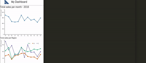
In the last part of the previous post I laid the ground work for our responsive dashboard. In particular, I used CSS’s flexbox to build a grid layer. In this post the objective will be to fill the grid with our D3.js visualizations. If you want to see the final product, check it out here. To see how the layout changes, be sure to resize your window. Here is a small preview:
Making your D3.js responsive
Turns our that making your D3.js responsive is not that difficult. Basically this is because D3.js uses SVGs as building blocks for creating visualizations. SVGs are highly flexible. In particular, they can be rescaled or transformed without incurring in quality issues (e.g. pixeling).
I found a helpful stackoverflow answer that explains how to make sure the graphics you create with D3.js are scalable. There is also this interesting post on the topic. If you want a deeper dive into SVGs in general and how to make it responsive, check out this post.
Once you make sure your SVGs that contain your graphs are fully responsive, the task is simple: choose the graph that will go in the right box. The layout is as follows:

This table will help you follow along with the code. You can find here the correspondence between the color of the grid, the name of the visualization, the CSS class assigned, and the variable assigned in the code.
| Grid Color | Name | CSS class | variable name |
|---|---|---|---|
| Blue | Total Sales | .main-graph-1 | sales |
| Red | Total Sales per region | .der1-graph-1 | salesperReg |
| Green | Stacked bar sales per region | .der2-graph-1 | stackedBarSales |
| Orange | Total costs | .main-graph-2 | costs |
| Purple | Total Costs per region | .der1-graph-2 | costsperReg |
| Fuchsia | Stacked bar costs per region | .der2-graph-2 | stackedBarCosts |
Adding each visualization to the graph is as simple as choosing the right box in which it will be displayed. If you have made your visualization responsive (see above), there’s nothing else needed: your graphs will fully adapt to the layout. Cool, isn’t it!
So far, so good. I was happy and surprised that it was quite straightforward to build responsive dashboards with D3.js. Then, it occurred to me: why not include a nice tooltip. From then on, everything went a bit awry.
Including a tooltip 1
Tooltips are normally used to introduce boxes that give more information of a graph. Tooltips are these info boxes that appear/disappear when you move your mouse on/out of a specific point. For example, if you put your mouse over a point in a sales graph, a box will appear that will contain exactly how much revenue was made on that specific month. This is a tooltip.
Here are some tips I gathered during my lengthy trial and error process of including a tooltip. I hope this helps you with your own implementation. Also, there are some things I still could not figure out exactly. So, if you have any tips or sources, be sure to let me know.
Tip 1: Not all coordinates are the same
As I explained, tooltips are normally displayed on top or next to a data point. When your mouse goes over one of these points, it will pass the x,y mouse coordinates to the tooltip in order to display it near the point. However, once visualizations are responsive, there is no longer a 1:1 correspondence between user screen and svg coordinates.
This was a source of major head scratching and, admittedly, frustration. I just could not figure out why the tooltips that were displaying perfectly for small screens, once the screen was made bigger, where all over the place. With a bit of patience, a nice cup of tee, and a bit of research, I found that other people had also been through that pain. Fortunately, they had some advice to share. This also lead me to a great explanation on the Microsoft Developer Network. Basically, this entry explains the difference between user and svg coordinate systems, and what is the way to find an appropriate transformation between them.
With that new piece of wisdom, I went on and find that it worked quite well for the small and medium formats. I could not figure out why the solution did not work quite well for the larger format. I suspect it has to do with the fact that I decided to introduce a margin width. While the x-coordinate was working well, the y-coordinate showed some unexpected behavior (kept augmenting although the graph size was actually fixed). If you have any other tips on this one, I’m all ears.
Tip 2: Follow the grid
Another thing I had to take into account to correctly locate the tooltip was the grid structure. After all, from the small, medium and big layouts there is a change in how visualizations are featured. Following this pattern is important, as I wanted to take into account what was over and next to the graph to ensure that the location of the tooltip was correct.
Perhaps this will be easier to understand with an example. Let’s take the last graph; our Stacked bar costs per region. Note that for the small layout, this graph appears right at the bottom of the page. This means that we will have to sum to our coordinates the height of all of the graphs above. If we do not do that, our tooltip will show on the top of the page, because it will not account for what is on top of it.
This is also true for the medium layout, where we will need to take into account the change of what is over the graph (note that Total Costs per region moves to the same line) but also what it is left to it, to take it into account what we should add to our calculated coordinates. I repeated this exercise with each and every single graph, checking what’s up and to the left of it in every transition from one layout to the other.
Tip 3: Be attentive to the screen size
So far, we can transform the coordinates and follow the changes of our grid. However, I am missing a major point: how to keep track of screen changes. I used two things for this: d3’s own event listener and enquire.js.
With the d3.select(window).on(‘resize’, foo()) function I was able to keep track of screen resizing. Whenever a screen resizing occurred, the margins were recalculated. This is specially important when hitting a breakpoint (e.g. passing from big to small). In this case, new margins and calculations need to be performed.
This d3 function takes care when the window is resized. However, I was missing the cases when the page is open for the first time. That is where enquire.js comes super handy. Enquire.js allows you to embed CSS media queries in your JavaScript code. With these queries you can also introduce the changes in margins and calculations as needed.
Just to be clear about how these two tools works. When you open your browser at a certain width, say 700px, the media query will kick in, showing you the medium layout. Then, say you readjust your screen to 1000px. This is when d3 listener does its magic, following the resizing and adjusting the calculations accordingly.
Conclusions
This project allowed me to get more acquainted with D3.js. I must admit, trying to get the tooltips right was more challenging than I imagined. I am open to your thoughts and your recommendation on how to make the tooltip location process less painful. As usual, you can check the code in my repo and have fun with the dashboard here.
-
For the moment, this feature is only available for Chrome and Safari. I am still trying to make it work in Firefox. ↩