Styling plots with Seaborn
So you have spent hours crunching numbers, figuring out how to use numpy and pandas, and you are finally ready for the fun stuff: plotting! After fighting with matplotlib for some time, there it is, you got it. Your first plot.
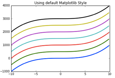
Then, it hits you: this look like something taken out of a 90s economic crisis/stock exchange crash type of movie. Of course, reading a bit more of documentation you discover that matplotlib is highly customizable. You can put a color to each and every single element of your plot. Of course, this is both a bless and a curse. While you want to customize your plots appropriately, you do not want to spend most of your time figuring out if the lila that you have chosen goes well with that pale blue to the right.
This need not be the case. Seaborn is a great library that can help us with this. Seaborn is built on top of matplotlib. It excels in two things. It is great for data visualization (e.g. distributions, histograms) and for helping us applying different styles. It is about this later feature that I want to talk about in this post.
There are some things I try to take into account when plotting. First, I want to know what exactly I’m plotting: is my variable categorical, does it have a certain ordering. Taking this into account is important also when styling. In general you want your figure to speak for your data. Choosing an appropriate color palette could help us discover and communicate in a clear manner what patterns we have encountered. In a not so nice version of the story, a wrong color palette could be deceptive, making you or your audience believe your data has certain patterns that are not corroborated by the data.
First Steps
The first thing that you want to do to work with Seaborn is download it and import it along with matplotlib.
#Importing Matplotlib and Seaborn
import seaborn as sns
import matplotlib.pyplot as plt
After importing it, you will realize that the plot you previously plotted with bare bones matplotlib has been given a set of styles. Looks much better, doesn’t it?
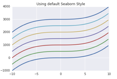
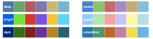
The same plot styling has been overriden by Seaborn’s default palette. You can easily change this palette by selecting one of the other available styles by using sns.color_palette("name_of_palette"). Here a quick overview of the available palettes:
Plotting Qualitative data
Besides using one of the already customized palette, seaborn also offers at least three other ways for plotting your qualitative data: hls/husl, color brewer and list specification.
hls/husl chooses the palette based on evenly spaced colors taken out from a circular color space. husl controls for color intensity. Note that you can always control how many number of colors you want your palette to be composed of (the default number is 8). You just need to pass it as an argument.
# Four hls color palette (left)
current_palette_4 = sns.color_palette("hls", 4)
sns.set_palette(current_palette_4)

# Seven hls color palette (right)
current_palette_7 = sns.color_palette("hls", 7)
sns.set_palette(current_palette_7)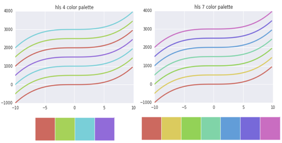
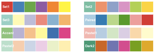
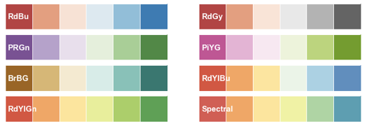
color brewer offers also interesting color palettes for working with qualitative data. The cool thing about it, is that you can use the a interactive Ipython widget function to make the selection of the palette. For this, you only need to use choose_colorbrewer_palette(). Check below the list of available palettes.
I used the “Paired” color palette to produce this plot:
current_palette = sns.color_palette("Paired")
sns.set_palette(current_palette)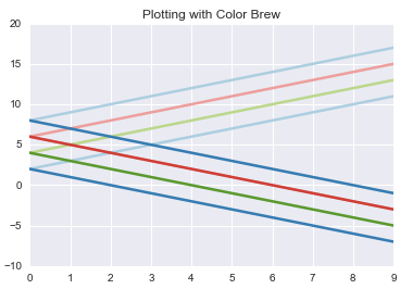
If you are really finicky about the color palette that you want to use, no worries. You can always pass a list of colors for your palette. Better yet, seaborn also offers the possibility of using a list of 954 named colors with the function xncd_palette(). Even cooler: if you are up for reliving your childhood memories, you can also use Crayola color names with .crayon_palette(colors).
col_list = ["warm grey", "gunmetal", "dusky blue",
			"cool blue", "deep teal",
			"viridian", "twilight blue"]
sns.palplot(sns.xkcd_palette(col_list))
col_list_palette = sns.xkcd_palette(col_list)
sns.set_palette(col_list_palette)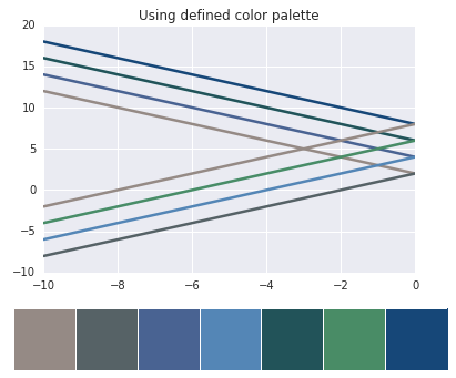
Plotting Sequential data
There is some kind of data for which we want our colors to reflect the magnitude of its values or its importance. For this, we can use sequential palettes. These palettes are based on a color, introducing small changes to form a palette. As with the qualitative data options, there are different ways to obtain the palettes.
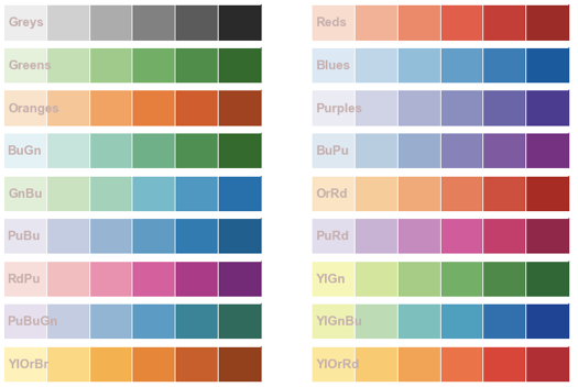
As seen before, here, you can also use one of the brewer options. If done so, it is always a good idea to use the interactive widget in IPython and explore different palettes. Here is a list of the sequential brewer options:
If you do not want to use the widget, you can simply pass the appropriate sequential color palette. If you need to reverse the attributes, just make sure to use the _r subscript. We do exactly that in the next plot:
seq_col_brew = sns.color_palette("Blues_r", 4)
sns.set_palette(seq_col_brew)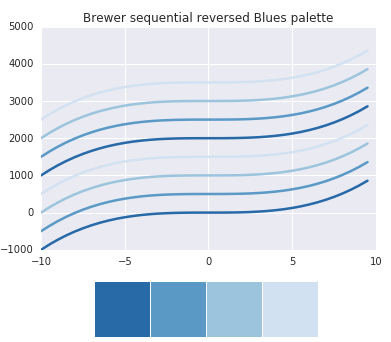
If you want a color palette that will also be informative in gray scale (e.g. when you need to print it), be sure to check the options available in cubehelix_palette(). Also, if you need a quick sequential palette, check the options available with light_palette() and dark_palette().
Diverging color palettes
Sometimes you want to emphasize low and high values of a dataset. For these cases, you can use diverging color palettes. Both extreme values are given the same emphasis. The ones in the middle are watered down.
Once again, you can use the color brewer palettes for diverging data. Here are the palettes available with this option.
If you want to specify exactly the colors you want, you can always try the IPython widget with choose_diverging_palette(). This widget allows you to interactively specify the degrees of the color wheel that the extreme colors of the palette will have (those that will represent lower and higher values). Once determined, you can pass it to the function sns.diverging_palette(degree_low, degree_high).
In this case, I wanted a diverging color palette that has a green value for the low values and a blue for the high ones. I selected the appropriate angles, and obtained the following color palette.
#Diverging palplot specifying color wheel angles.
sns.palplot(sns.diverging_palette(128, 240, n=10))
For the correlation matrix below, I passed the color palette created above. However, in this case, I needed to select the option as_cmap = True.
#Plotting with selected diverging color palette
plt.matshow(final_corr_mat,
  cmap=sns.diverging_palette(128, 240,as_cmap=True))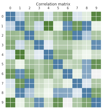
If you want to know more about seaborn styles, be sure to check their detailed, yet incredibly friendly tutorial and api reference. You can also check here the accompanying jupyter notebook that I created. Hope this quick post will help you plot more appealing and informative graphs!